

“Odd Harmonic is where sound, art, and circuitry meet—part DIY laboratory, part surreal temple of noise.”
Who better to partner with for a logo than “That’s Weirdo Stuff?” Here’s how we arrived at this design:
Phase 1 - Ideas
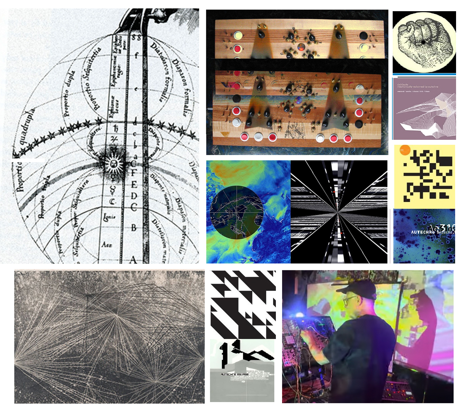
Artist and Producer Derek Morton’s brief and mood board was perfect: he provided core ideas and inspirations (like performance videos, art and music) without being overly prescriptive. This gave me a clear direction while leaving plenty of room for creative freedom.
Phase 2 - Trying Things
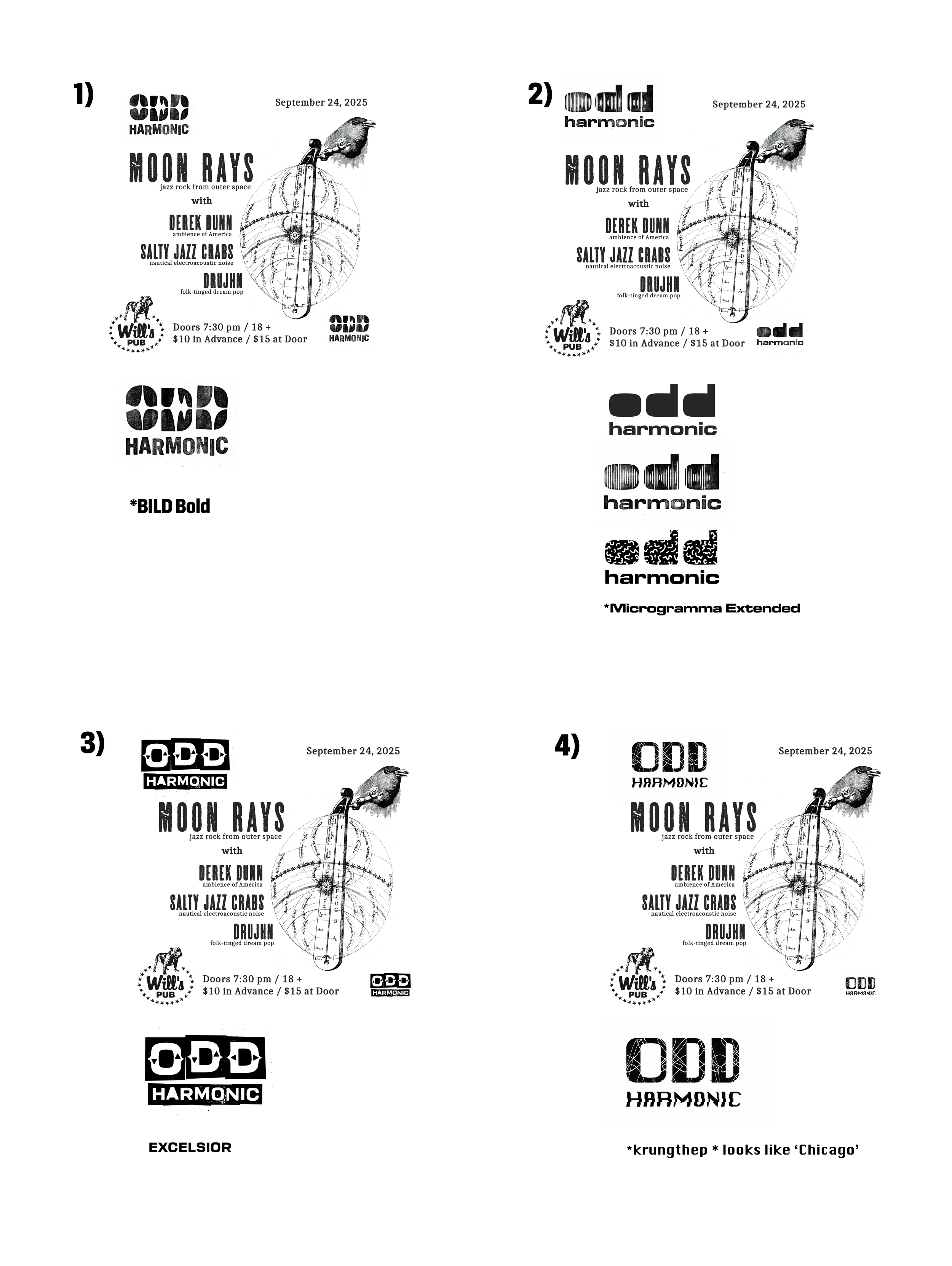
To contrast electronic music with the past, I offered Derek four directions:
1) Letterpress + Digital: Pairing clunky, older gothic letterforms (from DJR’s Bild) with a digital waveform to bridge old and new.
2) Vintage Synth + Patterns: Used Microgramma (the OG Eurostile) for a 1970s synth-keyboard vibe, using rotating patterns inside the text.
3) Signage + Shapes: Leaned into a woodblock and local signage look using my own WIP typeface, Excelsior, though it didn't quite land.
4) 80s Type + Analog: Combined 70s waveforms with nostalgic early Mac typography. Turns out Derek isn’t a Mac person, so it was a miss!
Phase 3 - Icing the Cake
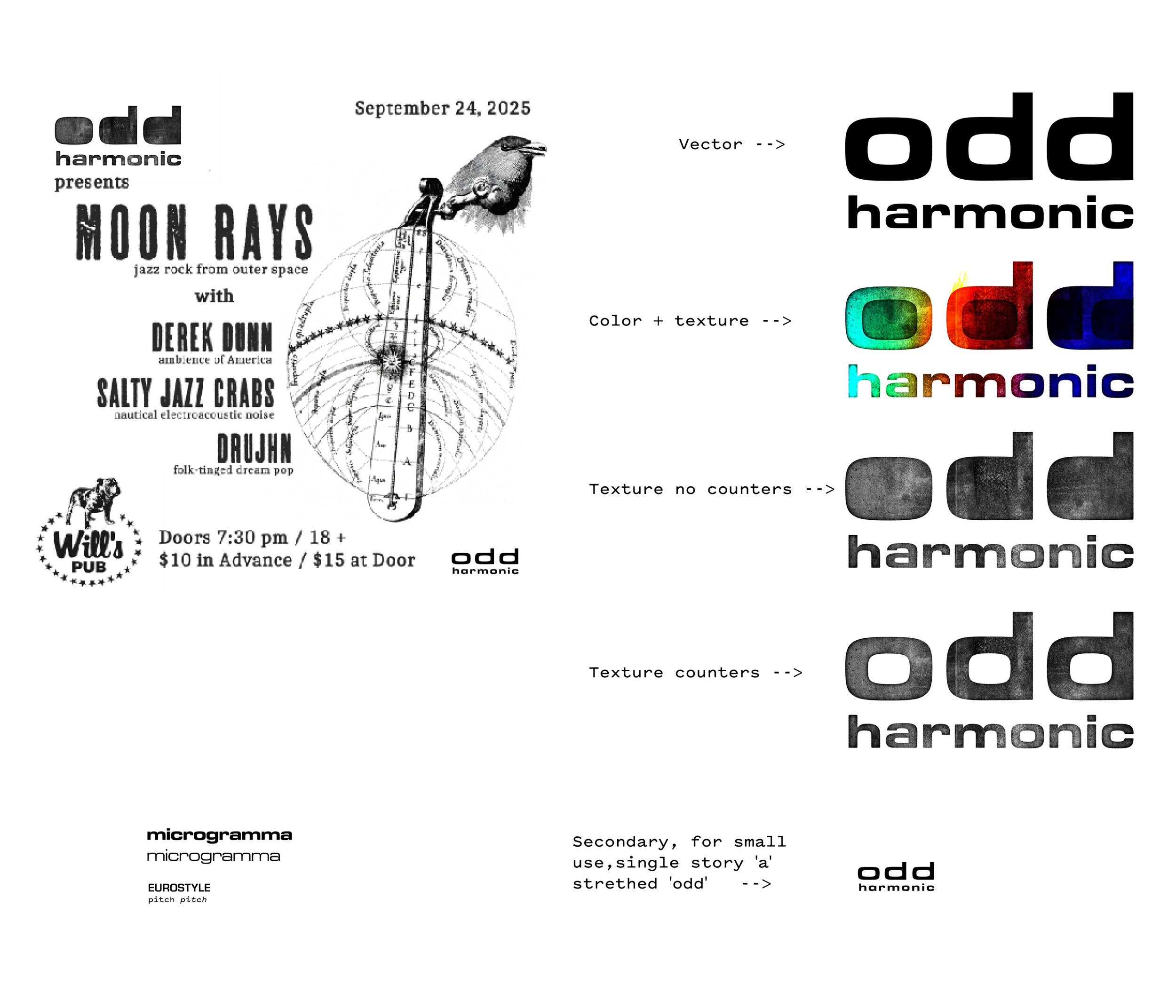
I polished it up and offered primary and secondary versions for him to use, including one for very small sizes. I removed detail from the a and d to help the letters work in this context.
I’m excited to start seeing it in use and I’ll continue to pitch in with branding and flyers for Odd Harmonic as time and budgets allow.