

Essential Life Skills
for Boys & Girls
For this project, I handled the cover, interiors, lettering, and illustration — a perfect mashup of all the things I love. The lettering guided the illustrations, the illustrations warmed the type, and everything stayed consistent from line weight to layout. Dream project territory: one day I’ll get to design the typeface and the cover and the art. 🤓 Scroll down for the step-by-step of the cover design process. Hop over to the graphics section to see the interior illustrations.
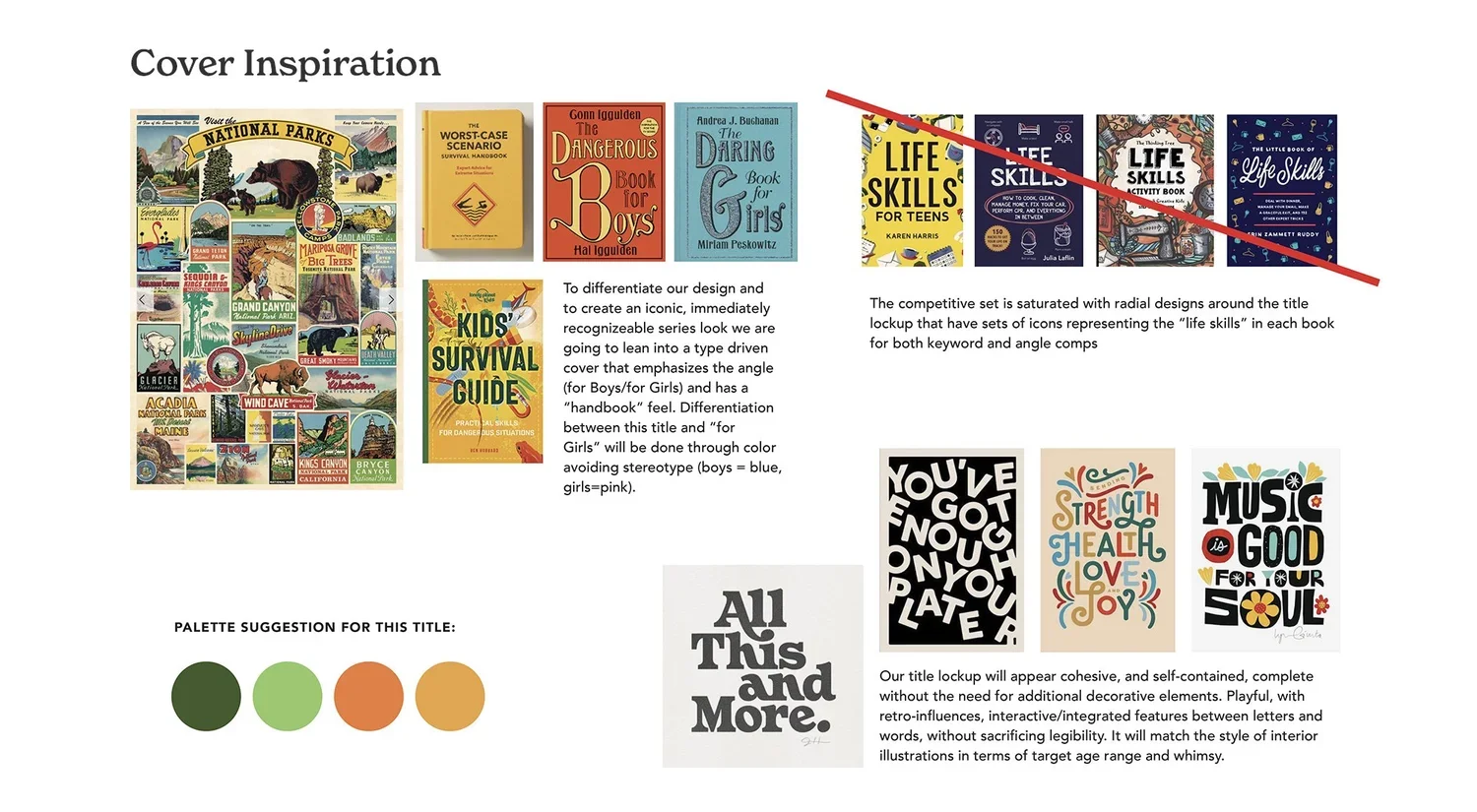
Phase 1- Mood Boards & Brief: The brief set the tone with a clear style and palette, encouraging a type-driven, hand-lettered look inspired by vintage handbooks and park posters. It also needed to stand out within its category and leave room for a companion title, Essential Life Skills for Girls.
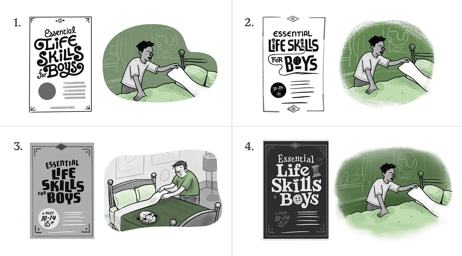
Phase 2- style exploration. I explored four cover-and-interior combos, mixing lettering and illustration in different ways: 1) Swashy cover + monoline & solid fills 2) Interlocking cover + monoline & ink wash 3) Vintage Boy Scout cover + dry ink & ink wash 4) Windsor/Clarendon-inspired cover + dry ink & watercolor Each one tested different moods and layouts while keeping the project cohesive.
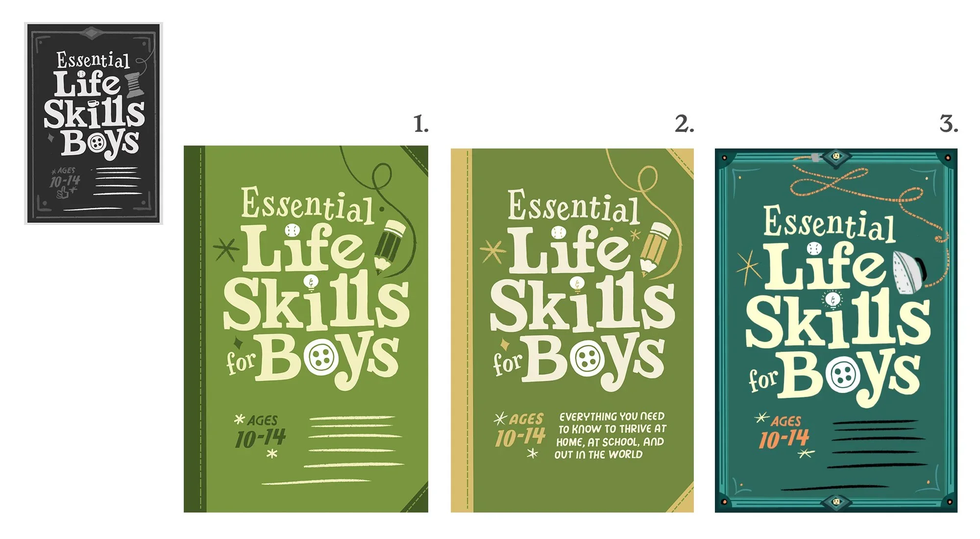
Phase 3- First pass of cover The team liked the lettering and layout style of option four as a starting point. From there I went on to fine-tune the initial sketch and introduced color. Keeping the work in Procreate for this phase allowed me to keep things easy to revise.
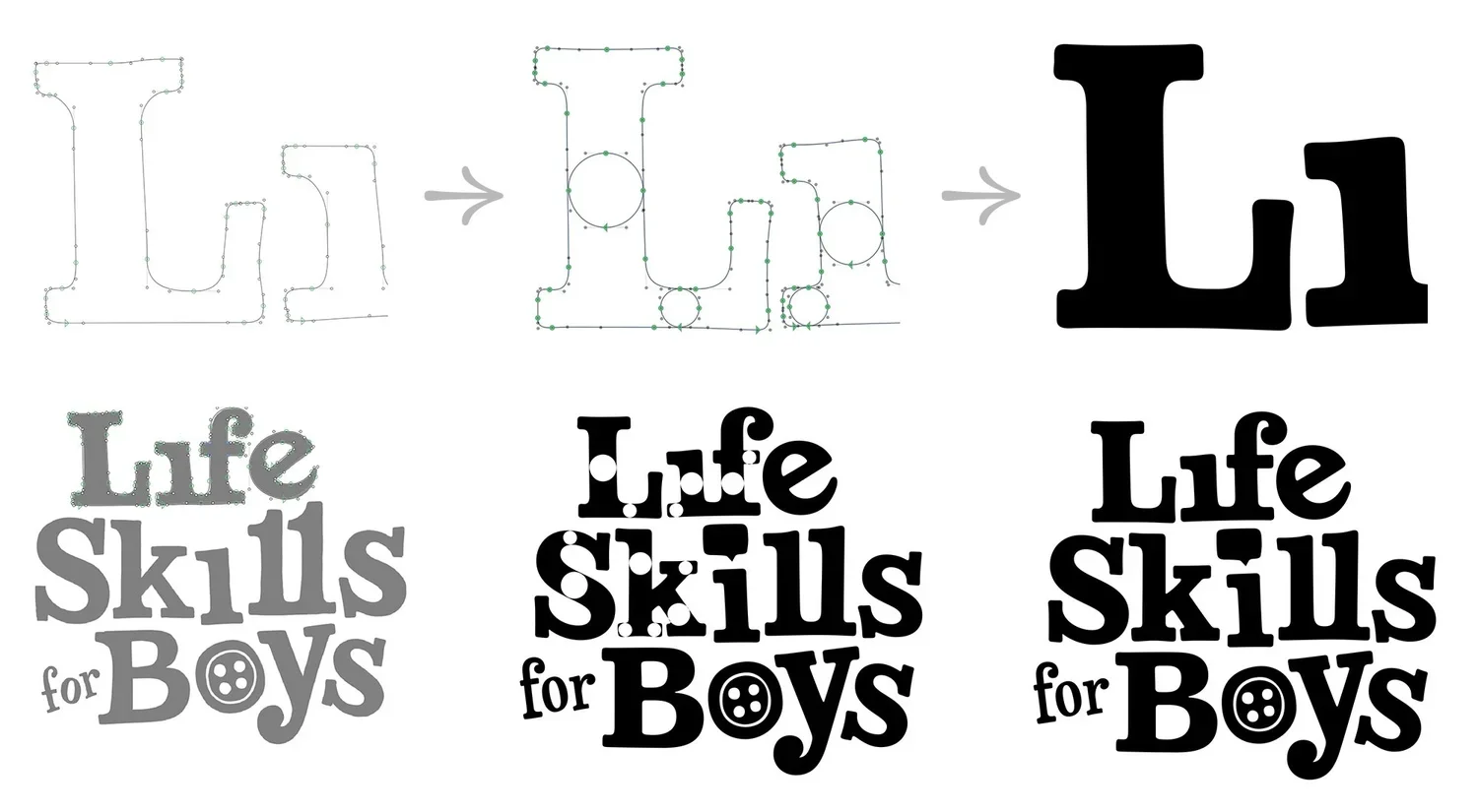
Phase 3- First pass of cover lettering At this stage, I realized that the lettering wouldn't change much, so I proceeded to vectorize. I begin with the procreate sketch and then refine the lettering in Glyphs because its tools are more suitable for this task. (Whenever I start in Illustrator, things end up a bit wonky, and not in a charming way.) First, I do a rough draft, then I align the vertical and horizontal widths, refine it, and finally move it into Illustrator.
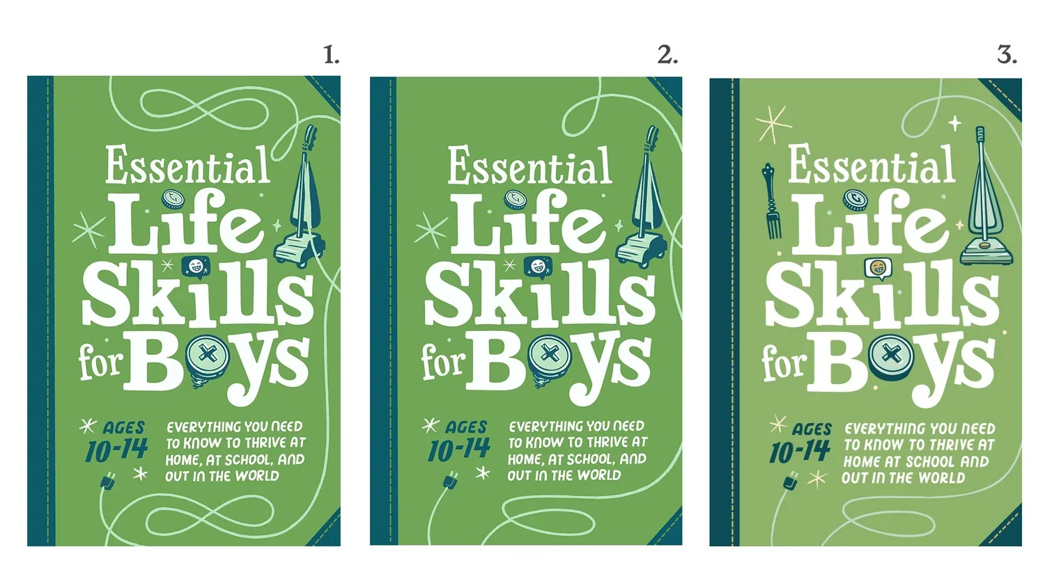
Phase 4- final layout options
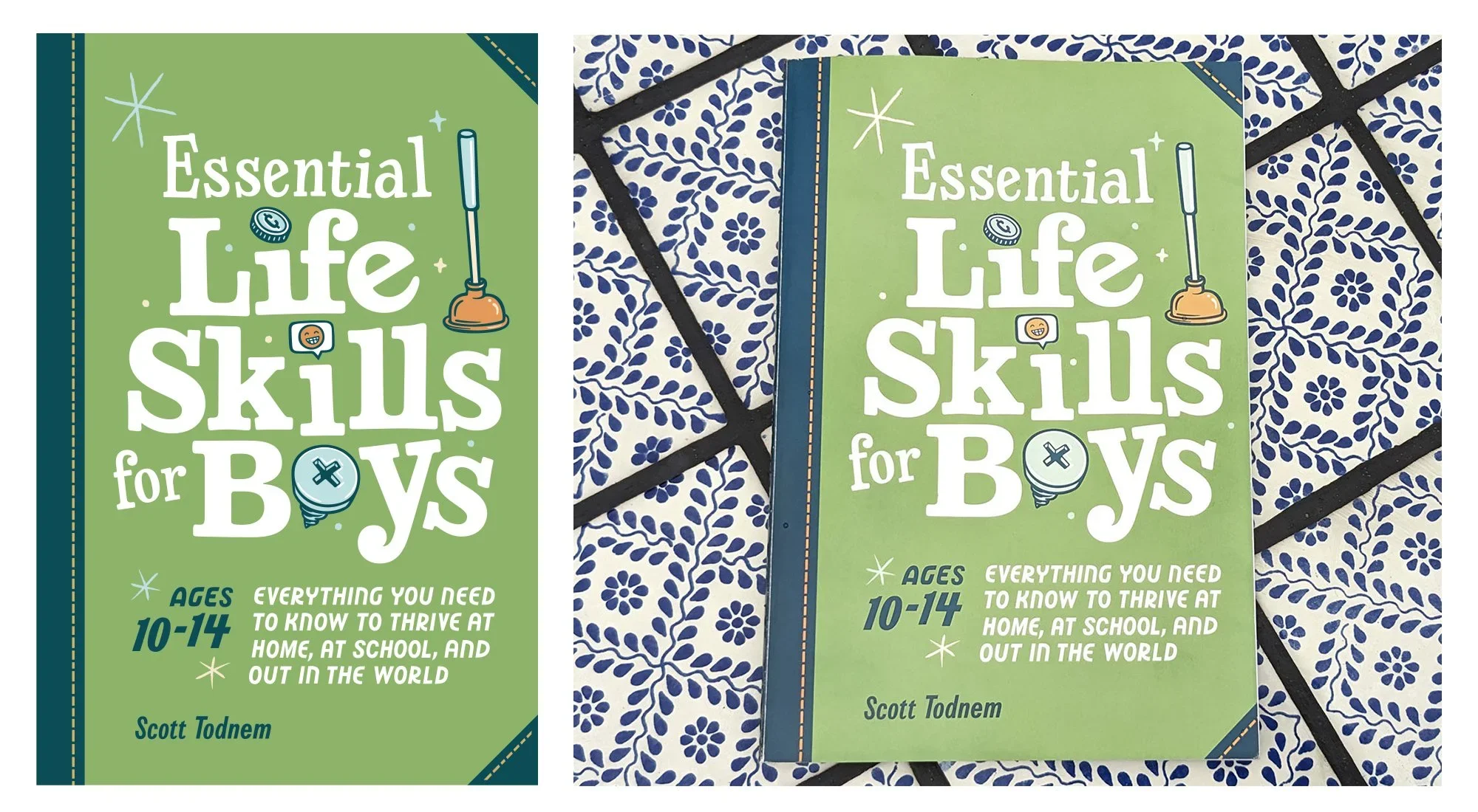
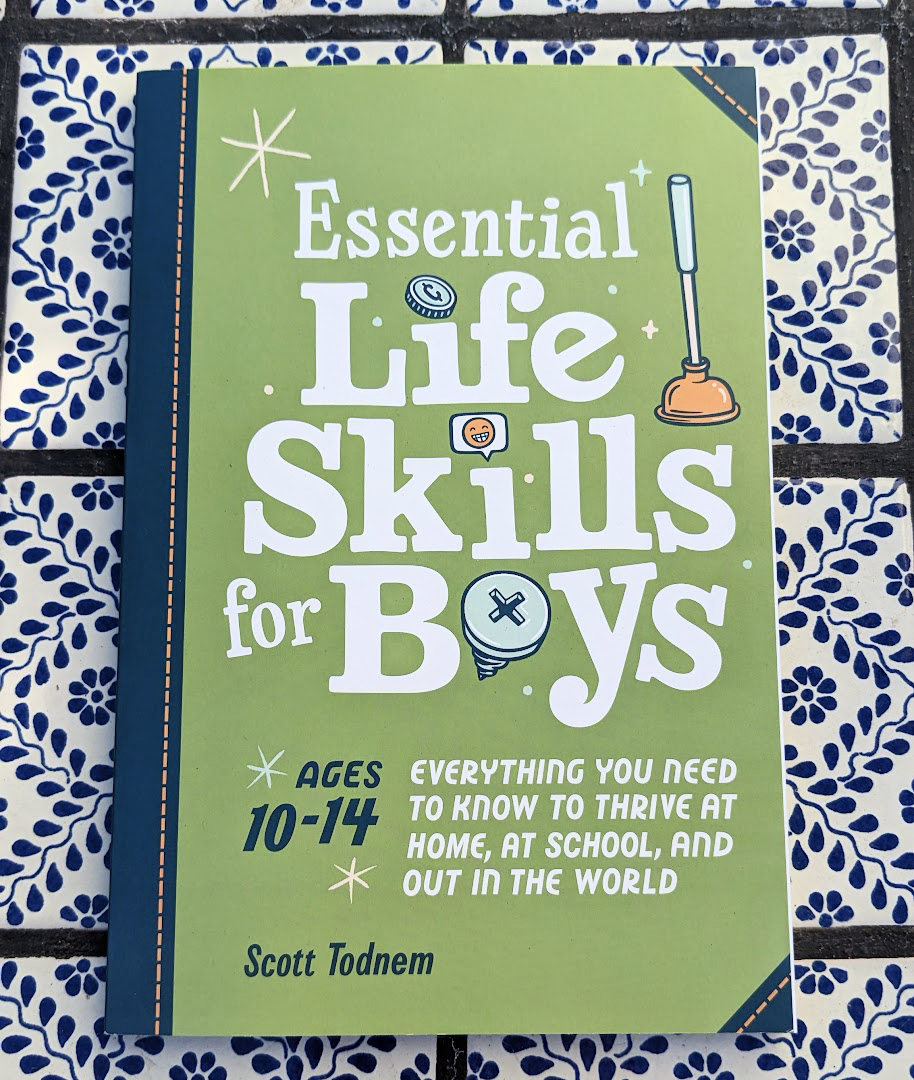
Final Art! In the last review, we made a few more updates to the icons, and then I prepared the file for printing. The book designers finalized the Pantone colors, and here is the finished product!
Cover Art for the Companion Book
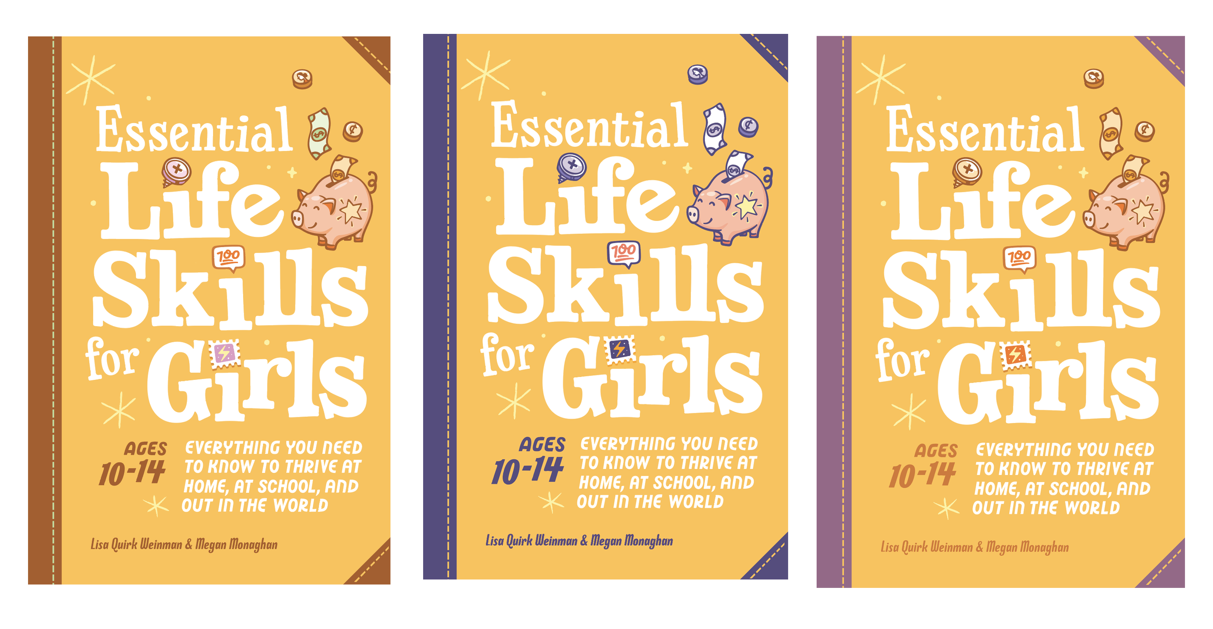
Update of the cover for the second book

The title page uses the same lock-up and I love how it pairs with the illustration on the left
Final cover art