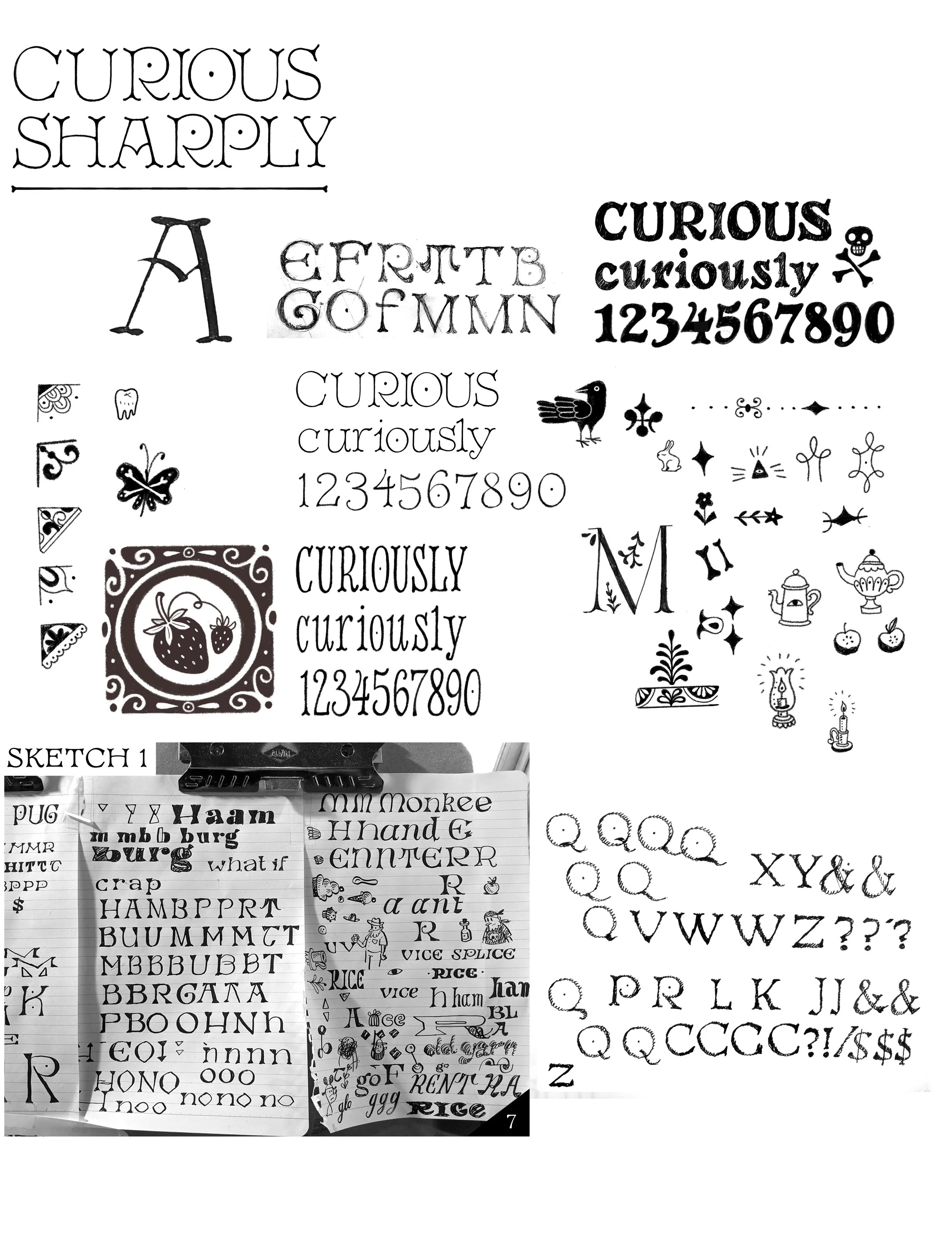
Curiously is an unconventional
old-style serif display family
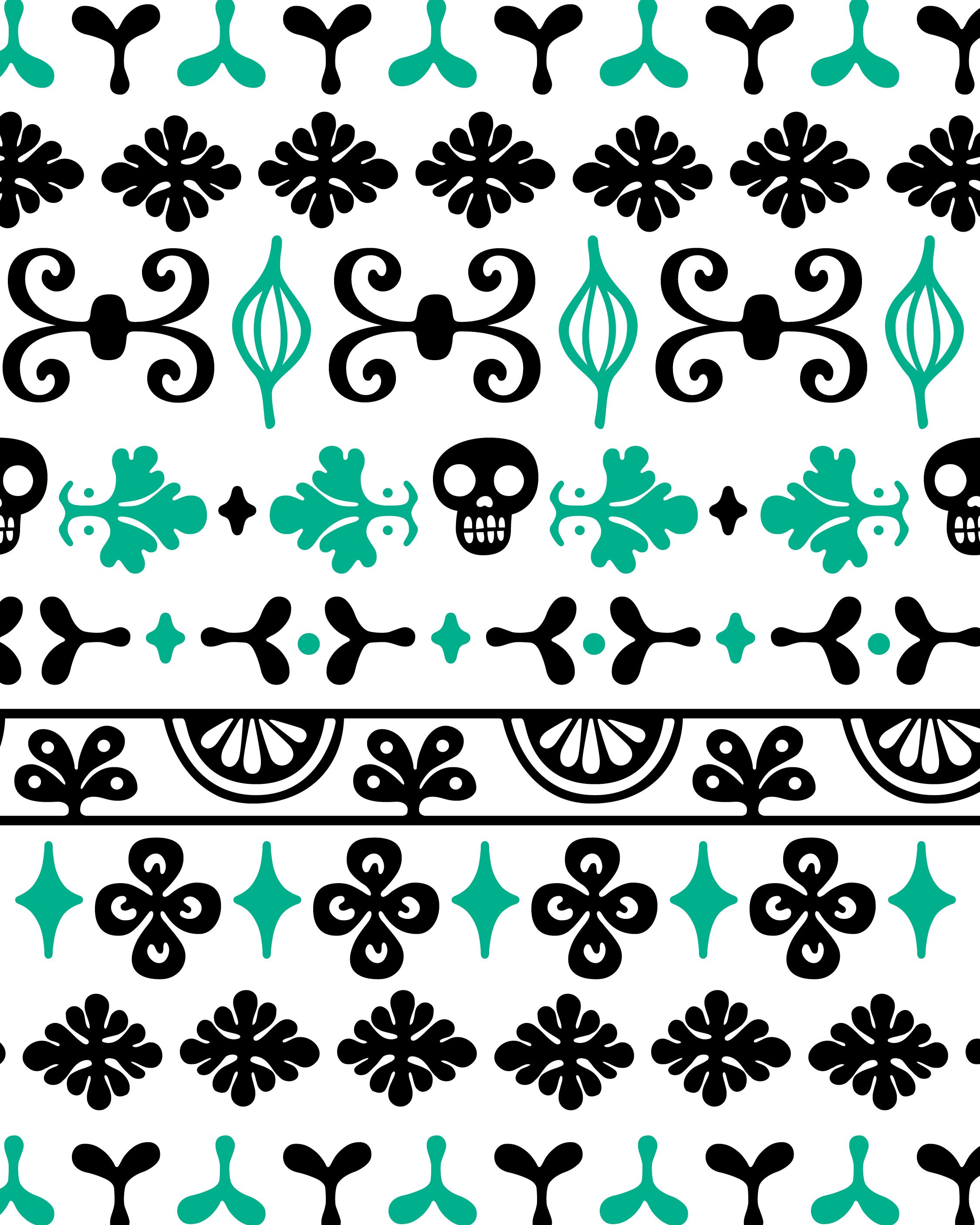
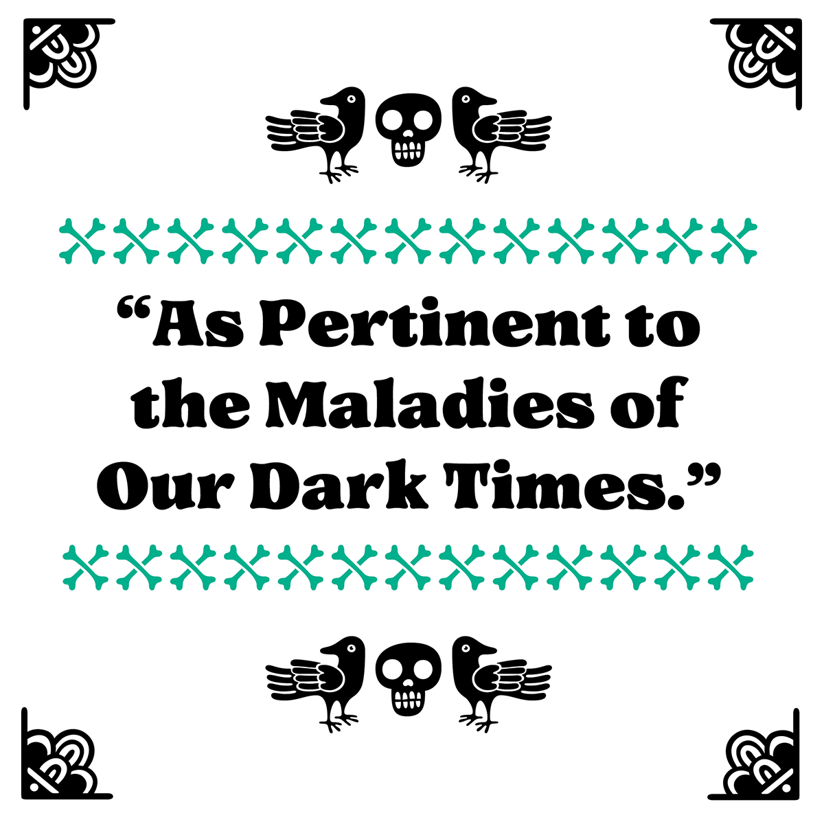
Shaped by my fascination with 15th-century Roman letterforms and my childhood immersion in beautifully illustrated 1970s–80s children’s books. Its characters are wide, open, and high-waisted, with distinctive bone-shaped stems and serifs, a diagonal axis, dotted counters, and a set of ornaments designed to echo and support the letterforms.
Rounded stems, serifs, terminals, and joints pair naturally with illustration and reveal a handmade quality when set large. The family works well for logos, branding, book covers, and editorial design, but for me the heart of the project lies in how the ornaments and typeface speak to each other.