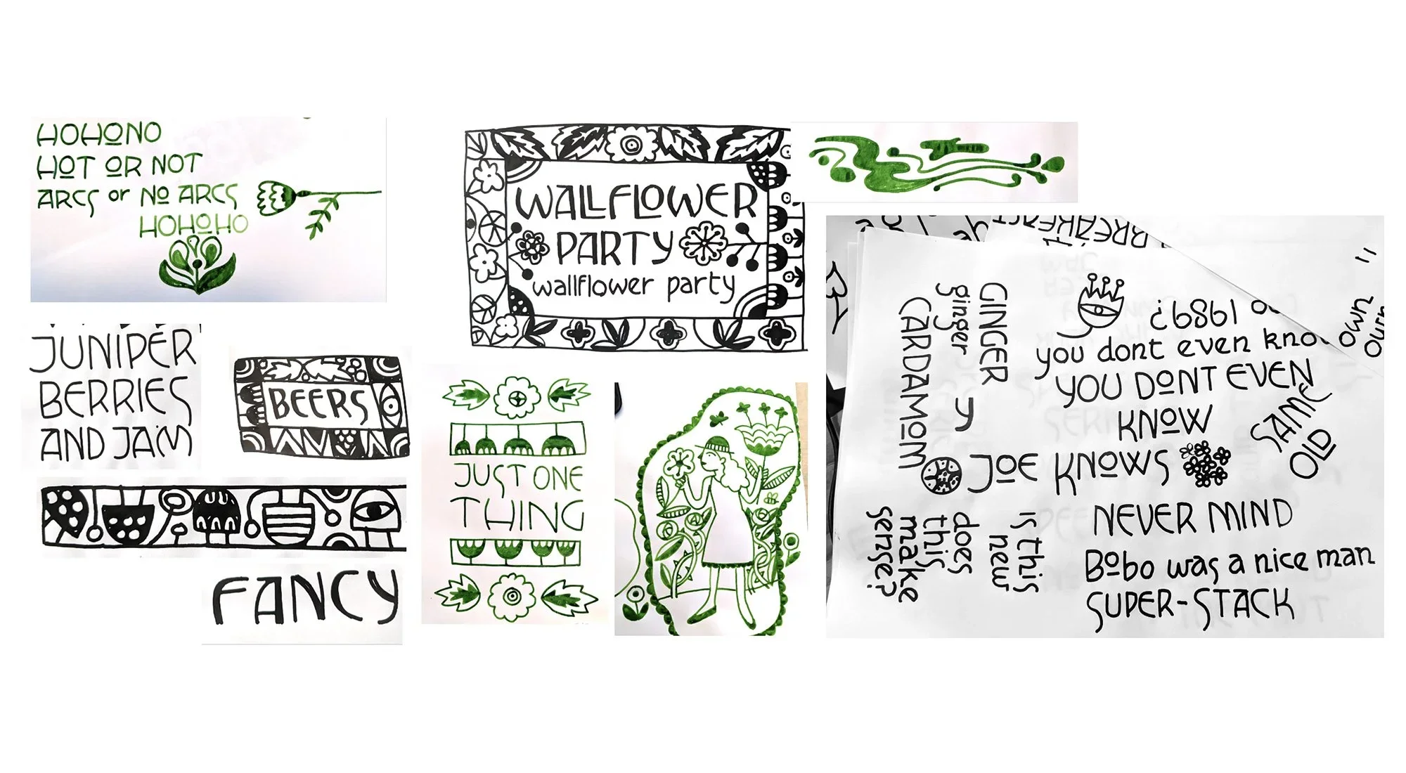
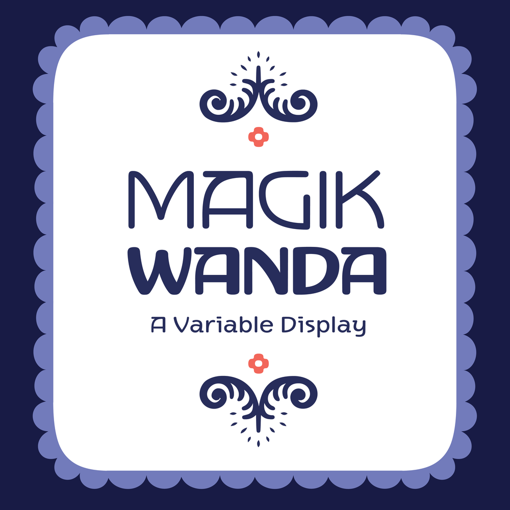
Magik Wanda began as inky, hand-lettered drawings made with a Speedball Series B nib.
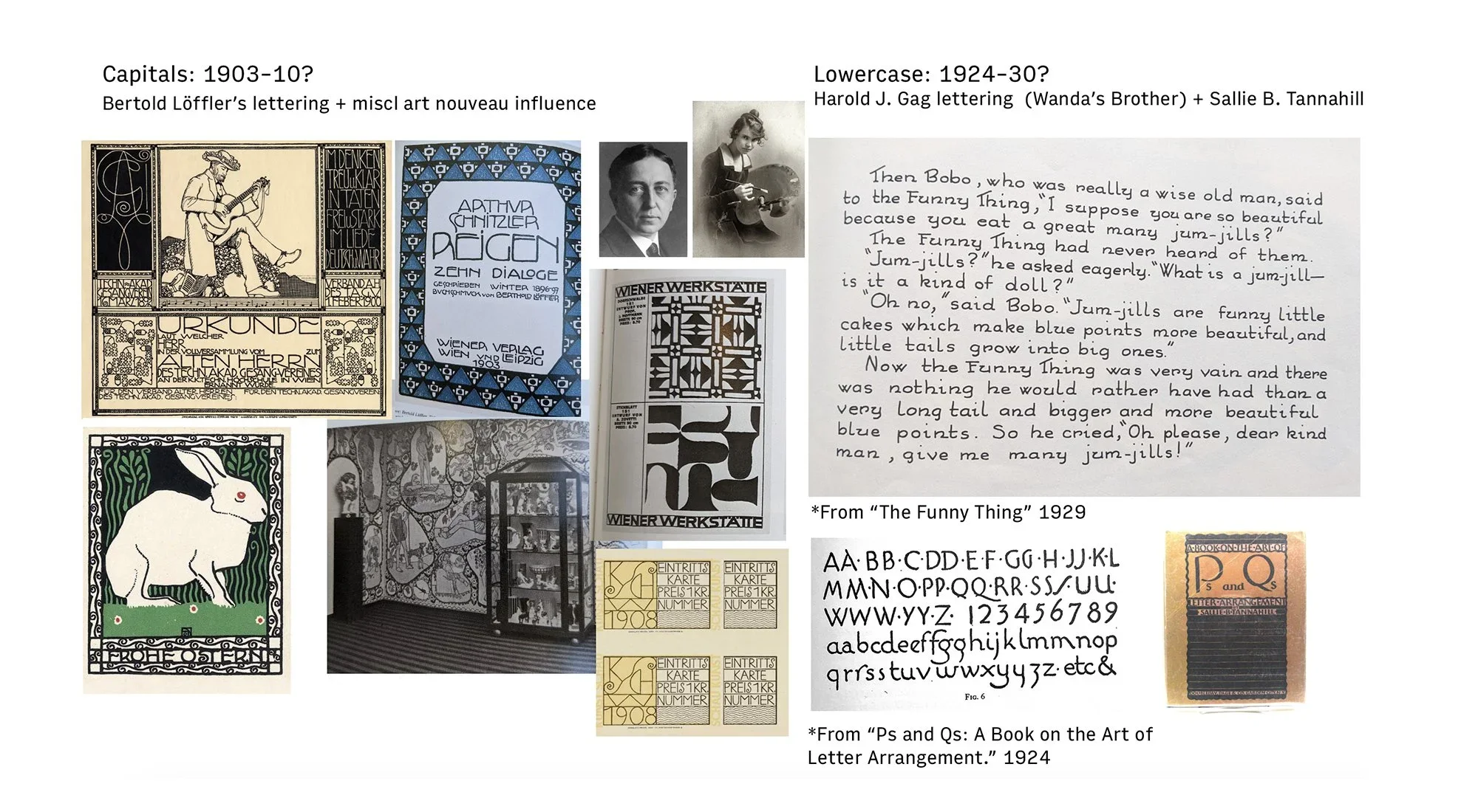
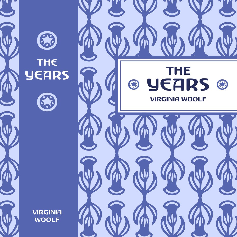
As it evolved, it drew from the lettering of the Vienna Secession, (especially Berthold Löffler) the illustrated typography in Wanda Gág’s 1920s children’s books, and elements of my own signature style. The almost-monoline light weight stays true to its round-nib origins, while the heavier weights pick up a high-contrast Art Deco energy. The result works beautifully for food packaging, beauty and wellness products, restaurant branding, cookbooks, and publishing.
Though primarily a display face, the lighter weights hold up well in text. Variable width and weight axes help the ornaments integrate seamlessly, allowing line weights to match across scales, something I appreciate deeply as an illustrator. For this first release, the Basic Latin set is complete, along with a set of ornaments filled with borders, patterns, birds, kittens, food, and flowers.